

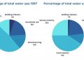
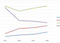
The graph below shows the population of a particular country by age group starting in 1960 and including a forecast to 2040.
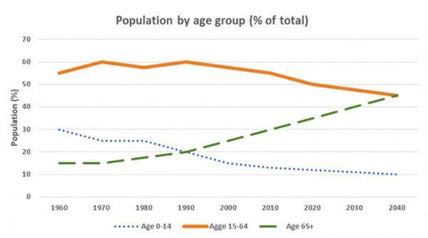
The provided line graph illustrates population of a country by three age groups from 1960 to 2040.
It is noticeable that the figures for people aged 0-14 and 15-64 decrease over the shown period while the opposite was true for the 65+ age group. The percentages for 0-to-14-year-olds and 15-to-64-year-olds are expected to be the same in 2040.
In 1960, 55% of the population belonged to the 15-to-64 age group whereas people over 65 accounted for only 5%. The figure for 15-to-64-people fluctuated in the following years and reached 60% in1990 before dropping to 50% in 2020. Meanwhile, the percentage for the elderly over 65 years old increased gradually to slightly more than a third in 2020.
The figure for people under 14, which made up 30% of the total population in 1960, declined slowly to 11% in 2020. It is expected to continue the downward trend and to hit the low of 10% in 2040. The percentages for people aged 15 to 64 and senior citizens are forecast to go in different directions and to cross each other at 45% in 2040.
(183 words)
Bài mẫu được viết bởi Callum Nguyen. Nếu thấy bài viết này hữu ích hoặc có ý kiến phản hồi, hãy bình luận bên dưới nhé! Xem thêm các bài mẫu IELTS Writing Task 1 của mình tại đây


![Bài mẫu IELTS Writing Task 1 #08 [Bar chart]](https://nguyencanhtuan.com/wp-content/uploads/2021/08/Bar-chart-120x86.png)


