

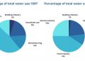
The charts below show the percentage of water used by different sectors in Sydney, Australia, 1997 and 2007. Summarise the information by selecting and reporting the main features, and make comparisons where relevant
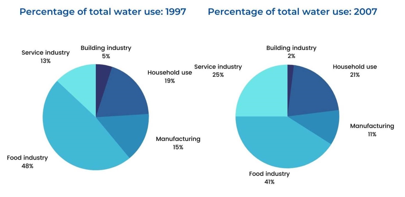
The provided charts illustrate the proportion of water used by five different sectors in Sydney, Australia in 1997 and 2007.
It is noticeable that the figures for food industry were always highest while the opposite was true for building industry. Also, service industry experienced the most remarkable increase in its use of water over the period.
In 1997, food industry made up 48% of total water consumption, whereas building industry accounted for only 5%. By 2007, the figures for food industry and building industry had dropped to 41% and 2%, respectively. Similarly, the percentage of water used in manufacturing experienced a downward trend from 15% in 1997 to 11% in 2007.
The proportion of water consumption in households, which stood at 19% in 1997, increased slightly to 21% over the following decade. Service industry was the sector witnessing the most dramatic rise in the use of water as its figure almost doubled, from 13% in 1997 to 24% in 2007.
(161 words)
Bài mẫu được viết bởi Callum Nguyen (IELTS Writing 8.0). Nếu thấy bài viết này hữu ích hoặc có ý kiến phản hồi, hãy bình luận bên dưới nhé! Xem thêm các bài mẫu IELTS Writing Task 1 của mình tại đây
Bình luận Facebook


